Filter resources
Type
Category
Industry
Product
2026 GenAI Code Security Report
Security Debt Has a Regulatory Deadline Problem: The 2026 Compliance State of Software Security
AI Code Velocity vs. Security: Insights from Veracode CISO, Sohail Iqbal
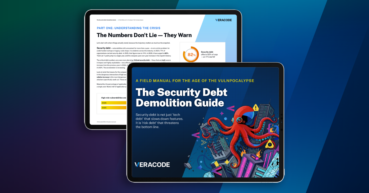
The Security Debt Demolition Guide
The New #1 Cause of Breaches — And How Leaders Respond
AI Coding Assistants
Zurich Seguros Turns Software Security into a Competitive Advantage with Veracode
CISO Roundtable: Managing Open Source Risk in Modern Software Supply Chains
Building Trust in the AI Era: The New Compliance Imperative